Presentation Zen

Best guide for presentations
By now there is a teachable logic to making a world-class presentation. Once you master the story-telling principles needed for a great slide show as taught in the previously reviewed Beyond Bullet Points, you can focus on perfecting the visual presentation of your ideas. This enhances the cinematic vs the script. Among the many guides offering design advice, this one is the best. Watch some of the most popular TED talks online (including mine) and you’ll see this advice in action. I can vouch that it will raise your impact.
09/7/12Excerpt
What is my absolutely central point?
Or put it this way: If the audience could remember only one thing (and you'll be lucky if they do), what do you want it to be?
*
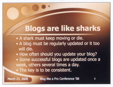
A traditional slide which duplicates the presenter's words. More of a reading test than a visual.
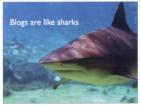
This slide serves to enhance the presenter's spoken words much better. The photo has impact and the point is made clearly. Which slide is more memorable? And since people are not reading, they can actually listen to you. (Photo of shark from iStockphoto.com.)
*
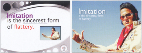
The slide on the left has a busy template which makes the useful area of the slide about 1/3 smaller. The slide on the right uses the image to cover the entire slide. The text is clearly foreground and the image serves both as background and at time foreground, making the overall visual more dynamic and more unified with a cleaner, more dramatic look.
*
Empty space is not nothing; it is a powerful something. Learn to see and manipulate empty space to give your slide designs greater organization, clarity, and interest.
Use the principle of repetition to repeat selected elements throughout your slides. This can help give your slides unity and organization.
Presentation Zen Garr Reynolds 2011, 312 pages, 2nd Edition $16


