Golden Gate Bridge International Orange
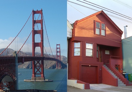
Todd Lappin has a wonderful ode to the color of the Golden Gate Bridge, and follows that with a very fine tutorial in how to acquire that color in case you want to paint, say your house, with it.

The color is a soothing earthy orange, almost organic in its overtones, very warm in the sun, yet also cheery in the fog. The color feels like a good wine. It is not far from the color of terra-cotta, which makes the Bridge towers seem as if they were made of fired clay. I never tire of the color and I crossed the Bridge twice a day for many years.
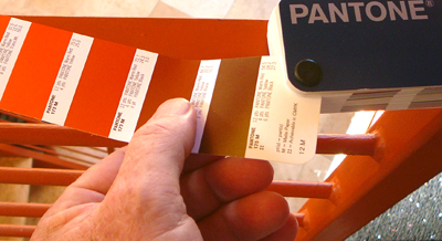
Todd was so enamored of the color that he painted his own kitchen ceiling the official color, which is called Golden Gate Bridge International Orange. This color is available commercially from Sherwin Williams as their “Fireweed” color, which you can have a paint store mix. You can of course mix the color using other brands of paint if you proceed with the instructions Todd delivers on his fabulous Telstar blog: the color is Pantone 173, or you can mix it using the conventional elements in CMYK.

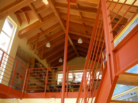
I love the color so much that all the metal work in my studio/home office is painted this color. I choose the color to ape the Golden Gate Bridge, but I had not done the homework that Todd had in researching what the color actually was. Still, I got it pretty close as the Pantone sample above shows (it’s closer to Pantone 173 than 174 in real life). We painted the railings and girders of the glass catwalk and sides of the stairs this comforting orange. It’s a subtle signal, but the color is one of the reasons most visitors remark on how welcoming the studio feels, even when we are drenched in fog, which is often.

Golden Gate Bridge International Orange? Give it a try!


