The Used Future
The most shocking aspect of the original Star Wars films on first viewing so long ago was not their gee-wizardry, or the coolness of alternative worlds so richly rendered, or even the arch-mythic story of a hero in the space age, but the brand new idea that the future could be gritty, worn, dilapidated and a mixed bag of modern and ancient. The “used future” of Star Wars was entirely new to me, and liberating.
In Charles Champlin’s coffee-table biography of George Lucas, he notes “… Lucas’s emphasis on the idea of a used future, a future that was meant to be experienced as reality rather than fantasy. The Star Wars future was not showroom shiny but dented and rusty, as if it hd hard use on the back roads on innumerable galaxies. Lucas told an interviewer during production in England that the Apollo casules may have looked brand new when they soared away, but it was clear when they returned that the interior was littered with candy wrappers, empty Tang cans, and other trash, just like the family station wagon.”
The heterogeneity of old and new felt absolutely real in a profound way, and the future has not been the same since. This “Star Wars esthetics” has influenced not only all of science fiction since, but also the design of cities, fashion, literature, industrial design, and design in general. In short, Lucas’s vision of a used future has shaped our own future.
That’s the thesis of a remarkable manifesto, Star Wars: A New Heap by the artist John Powers. It is one of the densest, highest ideas-per-page reads I’ve had in a long while. It appears in an innovative and very likable web-booklet form on triplecanopy, a new online magazine of idea-art. Here are a few excerpts:
In defiance of conventional wisdom, Lucas revealed a place that was modern, but not new, a future long occupied, unfinished, worldly. Modernity is the presumption that the natural environment for man has yet to be built. Lucas was the first to imagine that future built environment as already old.
“I was working very hard to keep everything nonsymmetrical. Nothing looks like it belongs with anything else…. It’s a very common thing in science fiction to see a set that has one influence. Everything matches. The chairs match the table, match the rug, match the design of the doors, match the door handle, match the lamps. I wanted it to look like one thing came from one part of the galaxy and another from another part of the galaxy.” — George Lucas, quoted in “The Making of Star Wars”

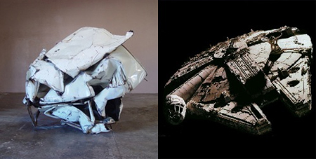
A flying saucer had never been a slum before. The immaculate silver sheen of the saucer was reinvented as a dingy Dumpster full of boiler parts, dirty dishes, and decomposing upholstery. Lucas’s visual program not only captured the stark utopian logic that girded modern urban planning, it surpassed it.
Lucas attempted to reproduce the sense of immersion in an alien culture that he experienced while watching Akira Kurosawa’s historical dramas for the first time. The Hidden Fortress made a particular impression on Lucas. The film follows the misadventures of two peasants fleeing their own army after being mistaken for enemy soldiers and forced to bury the dead. They are the lowest of the low, dressed in rags stiff with filth and stinking of carrion. It is though their eyes that Kurosawa’s film unfolds. Star Wars follows two equally worn and dirt-streaked losers, who happen to be robots. Kurosawa created historical realism by layering his sets and characters with patina, wear, and filth. Lucas created a realistic future out of distressed surfaces, oil stains, and a soundscape that included grinding gears and backfires. Kurosawa called his attention to realism “immaculate reality”; Lucas called his a “used future.”

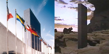
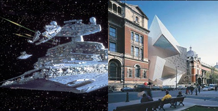
Kubrick’s film presented a future of company men moving with assurance and clear intention toward a godlike minimalist object. Lucas, on the other hand, gave us a slapdash world of knuckleheads pursued by industrial-scale minimalists. Visually, Kubrick’s film is as seamless and smooth as the modernist authority it mirrored. Like the mid-century modernists, 2001 associated abstraction with the progressive ideals of the United Nations as embodied by its New York headquarters. Lucas, on the other hand, was a nonbeliever. Even the initially smooth and unitary form of the Death Star was shown, as the rebel fighters skimmed its surface, to be deeply fissured with an ever-diminishing body of structural fragments. These crenelated details suggested a depth and complexity to modern life that modernism’s pure geometries often obscured.
Star Wars showed that we do not have to return to nineteenth-century pastiche and the top-down hierarchies it represents; instead, we can look forward to a future of incremental cities built by competing but interdependent players.

“Cities need old buildings so badly it is probably impossible for vigorous streets and districts to grow without them. By old buildings I mean…plain, ordinary, low-value old buildings, including some rundown old buildings…. Old ideas sometimes use old buildings. New ideas must use old buildings.” — Jane Jacobs


